
There are different ways to align your form labels and each has its own pros and cons.
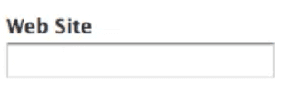
Top aligned
Pros:
- Easiest to process
- Fastest completion times
- Good for multiple languages
Cons:
- Takes up a lot of vertical space!
- Makes a long-form look even longer!
Left aligned

Pros
- Easy to scan labels, especially if you have a lot of optional labels
- Takes a little more attention to fill in, so useful for complicated forms that require accuracy
Cons
- Horizontal space, unlike vertical space, is not limitless, and an unintended horizontal scrollbar is the first sin of web development.
- Slowest completion times
- Poor multilanguage support
- Not even very good responsive support
Right aligned

Pros
- Best at linking label and form
- Good completion rates on small, common forms (i.e. Login, Sign up)
Cons
- Hardest to read and scan
- Poor multilanguage support
- Poor responsive support
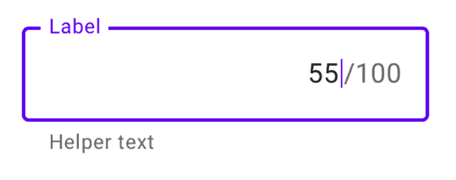
Material labeling
Alternatively, we can use Material labeling which places them inside the form and slides up on focus.
Pros
- Best for readability
- Best for visual connectivity
- Best for completion rates
- Decent multilanguage support
- Decent responsive support
Cons
- Extremely time-consuming to implement. Need to consider the cost/benefit.
- Not necessarily available on 3rd party platforms, like Wufoo or Microsoft Forms.
Love it
0
Agree
0
Disagree
0
No way
0

