
Data Layout - Do you show data and chart in one?
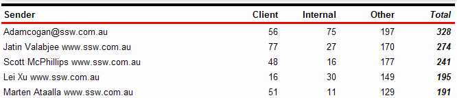
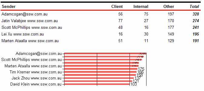
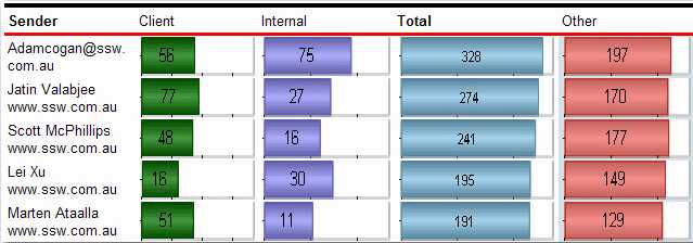
Last updated by Jeoffrey Fischer [SSW] about 1 month ago.See historyUsers of the report service will find the data easier to understand and compare. However, in order for the report to be understandable, the data and chart must be clear and uncluttered.
Love it
0
Agree
0
Disagree
0
No way
0
